Saturday, 7 May 2011
Thursday, 5 May 2011


Wednesday, 4 May 2011
Monday, 25 April 2011
Portfolio
At the start of January I decided to get my portfolio case. It cost me £65.50 + £4.50pp. A little expensive but a long term investment. The case itself is really nice and very professional. Something i recommend that everyone gets. Standard ones from the library are embarrassing.
Below is a list of suppliers and the specification of what i got.
PRAT Siva "Classic" Press Book 30cm x 42cm [PB1393042] £65.50
Below is a list of suppliers and the specification of what i got.
PRAT Siva "Classic" Press Book 30cm x 42cm [PB1393042] £65.50
Masters Degrees
Been thinking about doing a master degree if i cannot manage to get a job or internship in Graphic design. Here or abroad. The abroad topic i will have to research into. However, if nothing goes right as i want it to in my first year, a masters degree would be an option next year. Heres three places that i have been looking into. Both in type design.
These three University's are specialists in type design. Funding in Europe would be something that i would have to look into but in the Uk i'm a little worried about the fact it will cost me £9000 for a single year without living costs. A lot of money and no guarantees of getting a job afterwards. However its an option.
These three University's are specialists in type design. Funding in Europe would be something that i would have to look into but in the Uk i'm a little worried about the fact it will cost me £9000 for a single year without living costs. A lot of money and no guarantees of getting a job afterwards. However its an option.
Onlab Summer School
In the past few years onlab has been teaching as visiting professors in several universities and art schools in Europe. This year we are starting our own Summer School in Berlin.
Practical discourse is of special interest to us. Hence, the Summer School is set to establish the missing link between academic teaching and professional practice.
Practical discourse is of special interest to us. Hence, the Summer School is set to establish the missing link between academic teaching and professional practice.
Typography Summer School
A week-long programme of typographic study in London for recent graduates and professionals. Alongside live projects run by Fraser Muggeridge, the school hosts talks, seminars and tutorials from daily visiting practitioners.
Typography Summer School is a meeting place for graduates of graphic design, wanting to bridge the gap between student and professional and learn more about typography. The school brings together leading practitioners and participants to study, exchange ideas, and investigate the discipline.
As well as running a range of projects within typography with real clients and budgets, the school acts as a think tank encouraging research and dialogue. This environment provides a forum in which to discuss what typography is, its relevance in design history and the role it plays in today’s society. The school investigates the role of typographic design across ranging mediums, from books to film credits and posters to websites.
The school was founded by Fraser Muggeridge and is independent from any college or educational organisation. This website is designed by Fraser Muggeridge and Wolfram Wiedner.
Sunday, 24 April 2011
Website Development.
Below are some studio's websites that i like the design of. I'm after something that is very simply designed and has a basic menu. Mainly white or possibly black. If black than the photo's of the work will have to be shot on a white background. The viewing system of the work is a bit of a debate. I like the look of the horizontal scrolling however i'm not completely sure how to do it yet. I will have to do a bit of research into it. If the horizontal option is selected than i think the menu will be located at the top of the menu. Very similar to Tim Wans design. A introduction page will also be added that has my position statement. Also i wouldn't mind looking into splash pages - something i think i probably won't do because it might be hard to get right.
Things to research/consider:
Studio Hunt

 Studio Newwork


Things to research/consider:
- Horizontal Scrolling
- Identity Icons for Websites
- Splash Pages.
- Images sizes - depends on the grid.
- How to remove the indexhibit icon.
Studio Hunt

 Studio Newwork

Indexhibit.
Indexhibit has been chosen to construct my website. Because its almost set up for you like flat-pack furniture i think it will be easier than constricting my own website from scratch. Also Joe Gilmore is offering some tutorials on how to use it which will help. Below i have also listed some helpful websites for setting up you domain.
P.s Make sure you have you domain name and and webhosting ready for when you install indexhibit. Makes life much easier.
P.s Make sure you have you domain name and and webhosting ready for when you install indexhibit. Makes life much easier.
Domain Names.
Heres a list of domains names i have been thinking of using for my website. It's a tough process really because i'm not sure if i won't to sound like a studio or as an designer. I'm also not sure if i want to use .com or co.uk. Com sounds very international and corporate. In a way i do prefer it but after having discussions with friends believe that co.uk is the best option.
- www.rosas.co.uk
- www.rastanton.com
- www.rastanton.co.uk
- www.rossstanton.com
- www.rossstanton.co.uk
- www.rosss.co.uk
- www.astanton.com
- www.astanton.co.uk
- www.ralexander.co.uk
- www.r-stanton.co.uk
- www.r-stanton.com
- www.rsdesign.com
- www.rsdesign.co.uk
- www.thisisstanton.co.uk
- www.designbystanton.co.uk
50 Things Every Graphic Design Student Should Know.
Heres are very intersting post by Jamie Wieck from Airside graphic design studio in London. He has compiled a list of things that students and graduates should know when entering the industry. Mainly about getting internships and working with clients.


Tuesday, 12 April 2011
Fuck Me, Pay Me- Mike Monteiro (
Mike Monteiro Design Director, and co-founder of Mule Design Studio talks about troubles about being paid by a client and how to deal with them. Really funny and interesting.
2011/03 Mike Monteiro | F*ck You. Pay Me. from SanFrancisco/CreativeMornings on Vimeo.
Creative Mournings.
Creative Mornings is a monthly breakfast lecture series of creative types. Each event is free of charge, and includes a 20 minute talk, plus coffee! You can currently join us in New York, Zurich, Los Angeles, and San Francisco.


Monday, 28 March 2011


Thursday, 24 March 2011
Branding: Context_
KMS TEAM is Germany‘s leading firm for brand strategy, brand design and brand communication. Established in 1984, the firm now employs over 85 brand experts in the disciplines of consulting/strategy, text/concept, corporate design, communication design, 3D design, event design, interactive design, motion design, financial communications, pre-press and production.
“The Berlin-based VONROSEN fashion label distributes its products via the Internet. Reduction and an urban atmosphere are characterising the visual language of the brand appearance and match the classic-purist style of the collection.


“The Berlin-based VONROSEN fashion label distributes its products via the Internet. Reduction and an urban atmosphere are characterising the visual language of the brand appearance and match the classic-purist style of the collection.


Friday, 21 January 2011
OUGD301 Evaluation.
This module has been a Achievement in some area's of my design practice and a unfulfillment in others. I started this module with the aim of completing 4 comprehensive briefs and within this focusing my development on my design software skills. This would then lead to a more focused FMP and a more consistent portfolio.
I'm slightly disappointed that i was not able to complete all my briefs that i had set out to do. This is mainly due to mumps that i contracted during the end of the module that effected me longer than i had anticipated. Even though i had an extension to this module my body was not feeling 100% mentally and physically. However some human fault must be included in this. My management of my briefs was poor during this module. The studio brief ran over the allocated time limit of about 3 weeks. This was because i wanted to do too much with the brief with little time and that i was learning how to use illustrator at a more advanced level. Tutorials with tutors/ colleagues suggested that i reduce the amount of work i was doing for the brief and propose some of the work i was doing. Me being me i felt that i could get it all done and in the end couldn't. I should of been more realistic on what was achievable and what wasn't. I should of stopped putting deadlines back and finished the briefs at their current state.
Apart from this i was happy with the quality of the work produced and the skills i have learnt in the process. Attending indesign workshops have helped, however not all the skills learnt from them were put into practice until later in the module. Skills like baseline grids and style paragraphs have been very useful and will allow me to be more effective with my time in my FMP. Shortcut keys have also started to occur when i have been designing. Both in indesign and illustrator but more apparent in illustrator.
Illustrator has been a problem in the past for me, especially using the pen tool. So when this module began i specifically wrote in some briefs that would require vector graphics. This allowed me to get plenty of practice in using the pen tool and with some help from friends began to understand what i was doing wrong.
Overall this module has been a very interesting experience for me. I have learn't more things in 3 months than i have in the last 2 years. Mainly because i've worked the hardest i have ever worked before and because i had plenty of time to reflect when i was ill. The execution of my work has also improved. I began to get interested in minimal design at the end of year 2. You can now see this transition and how its effected my "style" of work.
In-terms of my progression of my design practice, the direction i want to head into has become much clearer. I want to design industrial graphics that require clear and detailed information. The next briefs i produce will reflect this more and with everything i have learn't in this module will be much more of a success. The quality has greatly improved and so has the understanding. Its just the focus and decision making that i must improve for FMP. Something i'm confident can be done .
Action Plan For FMP:
- Be realistic with work that can be done and cannot be done.
- Stick to deadlines. Can always come back and improve the work later on.
- Get into a pattern with doing research then developing, doing research then developing etc. Not; doing all the research and developing at the end.
- Be more decisive with planning and development. Work Faster.
- Constantly re-evaluate the work being done with the brief. What is needed and what isn't.
- Continue the development of indesign and illustrator skills. Especially shortcut keys.
- Get myself into some workshops for finish's and process's. Use some finish's for my pieces
- Collaboration with someone with opposite skill sets.
- Blog daily or have a specific day of blogging and keep to it.
Tuesday, 5 October 2010
B/C_001

Stock: 790gsm Mount Board
Dimensions: 85mm x 55mm
Colour: Cyan 40%, Magenta 0%, Yellow 0%, Black 100%
The business card i have temporarily developed for wednesdays lesson is fairly ok for now however the logo i have created is off centre by 4mm and the details on the back are a little hard to read due to the bleed of the stock. The 100% black on the front of the card has come out as i intended it to be, this is due to using 40% Cyan instead of making it registration. The whole look of the card is very professional and has some substance to it. It expresses my feelings, personality and my design practice. My personality is very simplistic and organised, i love minimal design and i like pastel colours.
This is the first card i have produced and i do expect it to change over the next couple of months. Ideally i would like it to be professionally printed off however the cost of lets say 2000 on the same thickness of stock with the logo spot varnished would be roughly £2000. A lot of money and this means i need to get friendly with some printers fast.
Considerations: Have 2 different types of cards. One on thick card that has been professionally printed off with all the finishes. And one card that is much more simpler. The reason for this is because a 3mm thick card in my wallet would result in me only carrying a few cards. Having a much thinner business card would be more practical for giving out when lets say on the tube or in a bar. Don't have your address on the card just incase i move house. Have a valid email address that is only for business and have plenty of white space on the card for people to write notes on the back.
Feedback:
More to follow.
Business Card Production 001.


Below are the files of my business cards before i sent them to print. The format is on A3 however i wish i had done them on A2 because it would of reduced cost and time. The cards should sink together pretty well because i have measured each document to a fraction of a millimetre however the process will be ruined if the mount board isn't square which i'm expecting it not to be.
Business Card Development 003.


Gone back to having the logo in the top right and it still looks like a postage stamp even though i have got my name beneath it.


I think there is a massive improvement with the legibility of the logo. Don't think i need my name beneath it because once you flip the card on its back you see my name and have a direct connection with the logo.
Business Card Development 002.


I have kept the coloured lines but just removed the "A" initial from the logo. much more legible now. Not too sure if you see the "R" first or the "A".

I have kept the coloured lines but just removed the "A" initial from the logo. much more legible now. Not too sure if you see the "R" first or the "A".

Some people i spoke too said that they couldn't see my initials in the logo. R, A, S. Because of this i have begun to develop the legibility of the logo through colour and by extending the lines. Here i have made the "A" much more visible. However do you now look at the A first before the R.


Thought my logo was a little too simple, even though thats what i'm after so i thought i might as well add a circle that had no meaning to my name. More of a aesthetic thing and the fact that everyone is putting things in circles nowadays. The result it something that doesn't mean anything and give an impression of don't go here. Like a stop warning sign. Not good.


Don't like all the details on one page and centralised. Looks very cluttered and not very professional. The back of the card has remained white so you can write notes on the back.
Business Card Development 001.


I thought it might be a good idea to see what my card would look like on a pastel colour instead of being totally on white or black. A bit more variation. I wanted to use the front colour on the type on the back however i feel that it wont be legible. However i feel that what i am after with the professional, architectural and minimal look will look much better on white or black.


I like the look of this card, the logo looks good centred and it gives off a feeling of importance. Might be tempted to make the lines of the logo thicker and to make the logo slightly smaller. The back of the card looks great also. Simply positioned into the bottom left corner. Very professional.


I prefer the black card to the white one, it has more substance and look more expensive. The fact i have removed the "T" and "E" looks much better also. The only problem i have with this card is that it looks like a envelope and not a business card. The back of the card will remain black.
Friday, 1 October 2010
Presentation_Summer
Below is my design strategy presentation for PPD. It reflects my design practice, my aims for the future and what i got up to during summer. Very simply laid out with minimal text. Hopefully i wont forget my words.
Tuesday, 8 June 2010
3rd year Objectives.
Below is a list of objectives i want to do during summer and into my 3rd year:
- Help in the preparation for the end of year show.
- Sort out my design for digital module.
- Sort out a new and improve portfolio that has a consistent style of work running threw-out.
- Start to plan out 10-15 briefs for my 3rd year.
- To stay in Leeds till the start of August doing work and helping to set out the studio.
- To keep in regular contact with industry studio's.
- To sort out a placement for the end of summer/ Christmas and Easter.
- To develop a logo and business card.
- To finish of developing my website and get it running.
- To read relevant books for my dissertation.
- To visit Berlin and switzerland for my dissertation research. This include type foundries and design museums. Also to embrace the culture and to buy some interesting design books to add to my collection.
- Holiday in Spain. Inspiration.
- To begin writing a introduction and possible first argument for my dissertation.
- Design and rehearse presentation for first day back.
- To look for a city centre apartment with a view. Inspiration.
- To Work solid threw out the remainder of the year.
- Live Projects. I have noticed that i have not attempted to do some reel briefs for reel clients.
Its a big list but i have 3 months to achieve this. I also hope to add a few more things to it during the course of the summer.
Saturday, 5 June 2010
Presentation Evaluation.
The presentation i did on Friday went ok. I overrun the presentation by 2 minutes however i got something i had felt had been damaging my process as a Graphic Designer. I admitted to the group that i was dyslexic. Something most people would not have a problems with and be very open, however with me its something i have known about since i was 5 and something that before friday only 2 people new of. Now i have admitted to the course and myself that i am dyslexic. Hopefully now i can move on and get hope that i was very reluctant to get. The Feedback i got from Lorenzo was very negative and positive at the same time. Everything i said was true and he agreed that my year had been as i put it a " catastrophe " however its something that can be salvaged threw the 3rd year but i must put a extremely large amount of effort into the process. Something i know i can do now i wont be living with the every hour every day party at my house. He also mentioned that he didn't feel that i should go back to old brief and improve them. I still feel that it is a good idea however i do get his drift. I should just sweep it under the carpet and start on something new. Jon's comments were good. He said my structure and presentation skills were great however i do feel because i had no text on my presentation that i wont get a good mark. In the end of the day this year has not been great, i have learnt new skills but not moved forward as much as i would like in my design practice. Next year will be a improvement and hopefully the best year of my life.
Friday, 4 June 2010
Presentation.
Below is my presentation for Fridays PPD. Its very simply laid out and doesn't have much text... well almost non. I believe that a decent presentation is achieve threw focal, good interaction with the audience (eye contact at all times) and relevant images.
What Will be covered:
What Will be covered:
- First of all i will talk about what will be contained within this presentation.
- I will then talk about my first year work. Things like not having a individual style of work. What my aims were at the end of the first year.
- Successful 2nd year work. I will talk about the success of the collaboration brief with Tim and Kate. What my role was and how that had a impact on the design. Publication design and that it was my first successful attempt since the failure of "what is a book".
- Talking about the last piece of work i did. That i am beginning to develop my own style. A style that i am happy with. How the process went and my thoughts on it.
- Unsuccessful 2nd year work. Will be talking about the first brief and how i was mainly focused on the concept and research not the print process's and experimentation. Not the greatest start to the year and that i felt i chose the wrong brief.
- Pro's and Con's. Talking about the good things i have picked up in a disastrous year. Mainly knowledge based stuff with software and process's. The negatives will be talking about my bad time management, personal problems with housemates, reluctance to ask for help, not moving forward from the first year but moving back. etc
- The direction of work i want to start heading in. Editorial, Research driven, data graphics, posters, minimal etc.
- Third Year objectives and summer. Also talking about studio's and companies.
- The confession.
Saturday, 29 May 2010
OUGD203 - Evaluation.
1. What skills have you developed through this module and how effectively do you think you have applied them?
3. What strengths can you identify in your work and how have/will you capitalise on these?
4. What weaknesses can you identify in your work and how will you address these more fully?
5. Identify 5 things that you will do differently and what do you expect to gain from doing these?
6. How would you grade yourself on the following areas:
Attendance 3
Punctuality 4
Motivation 3
Commitment 4
Quantity of work produced 3
Quality of work produced 4
Contribution to the group 4
I think this module has been a massive help. Learning about product ranges and distribution methods will be very useful in future projects. Mainly because i hadn't thought it was our role as designers to think that fare ahead. Looking into different technologies available to you has been really interesting and will be helpful since thats the direction that design is currently heading. Print will always be available however with such a high demand for quick accessible information it seems like this is the future. I have also been aloud to produce a large range of design idea's and development in the module compared to previous ones. This is mainly down to the brief i chose that had the information/ research already available. Normally i find myself doing research too much and not having enough time to design. However my only regret is not spending enough time developing data graphics even though i had looked at a lot of designers and made a lot of notes/ ideas.
The Collaborative brief was very useful also. I gained a few new approach's to idea generation and development. Some i might add to my own design practice. My software skills with In-design have also improved. Much quicker at using the software now and using keyboard shortcuts. I also discovered threw Tim Wan that i was doing some certain things in a very strange way. Hopefully now i wont be doing it so much.
2. What approaches to/methods of research have you developed and how have they informed your design development process?
2. What approaches to/methods of research have you developed and how have they informed your design development process?
This is basically the first project i have ever done that involved no primary research. The whole project has been about secondary: The Raytheon Annual Report 09. A lot of reading was involved with this report to determine if i could do the whole report or parts of it. Also selecting parts of it that might be useful or not. Design Context research has also been very useful in the development of my idea's and final publication.
The collaboration brief involved a hell of a lot of primary research. It was the first time i had gone outside Leeds and into a different country to gather research. A lot more one to one with people and having in-depth chats. Something i hope to do in future briefs.
3. What strengths can you identify in your work and how have/will you capitalise on these?
The quality of my work that i am producing now is much better than the first year and also that I'm starting to design the type of style that i have been aiming for without compromising the brief or product. For ages i have wonted to produce minimal styled design that have influences from switzerland and Berlin. Now i believe that i have take great strides towards this. I also believe that my idea generation has been good for both briefs. A lot more quantity and quality with a lot of thought behind it. Designing publications has been very enjoyable. In the first year i made a lot of mistake's and didn't complete "What is a book" brief. This year i have already done two publications that work very well and are very effective pieces of deign. The type and layout for each i believe it spot on however there's always room for improvement.
4. What weaknesses can you identify in your work and how will you address these more fully?
Overall this year has been shocking for me with problems personally and back home. My management of time, judgement and overall work ethic has been below par. Im very much aware of the problems and its something that i've been trying to improve each week. The collaboration module was great and my work production was good, however with this last brief it has not been the best. The steps i have taken to improve this have been to have my own place next year, pending if i'm still on the course and to admit to myself that i do need help. Something that i will admit on friday the 4th of June.
I've also not been happy by the fact that i have not experimented enough with process's and used the facilities enough around the college. I hope to this summer get the opportunity to do a few things and learn them as fast and effectively as possible.
The design boards that i created were visually good but had fare too many mistakes. Grammar mistakes that i noticed were about seven to eight. I also left a random orange box in the corner of one of my design boards and i feel that there is not enough text explaining what my product is. I could of resolved this by speaking to a member of staff or a friend but as usual left it till last minute.
Finally, my blogging has been poor yet again. Not all my design sheets have been blogged and annotation of each blog has been minimal. Since this is the main source of marking i don't expect to get a decent grade nor do i deserve to. Next time i need to blog everyday and every time i do something. Possibly leaving the writing part till last or making some rough notes.
5. Identify 5 things that you will do differently and what do you expect to gain from doing these?
- Spent more time developing data graphics that were more interesting and innovative.
- To be more direct with my decision making. Wasted the first two weeks worrying what to do. Should decide what i'm doing and just do it.
- Try challenging the grid system and break some rules. Be a little more adventurous.
- Get more advise from Graham and other members of staff about my work. possibly speaking to some outside creatives.
- I felt that i spent fare too much time at home, especially in the final week. Should be managing my time more effectively. Something I'm 100% sure will improve next year.
6. How would you grade yourself on the following areas:
Attendance 3
Punctuality 4
Motivation 3
Commitment 4
Quantity of work produced 3
Quality of work produced 4
Contribution to the group 4
Sunday, 2 May 2010
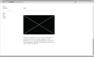
Posible Website Layout.
Below is the possible layout i might have for my website. As you can tell its very simply layed out with no colour. The images i will add to the website will ned to be photographed on a dark background. They will also need to be very well taken and have the same theme and structure running threw out. For the into page i'm very tempted to have a picture of me even though it should be a picture of my latest work.


Saturday, 24 April 2010
OUGD204 - Evaluation.
1. What skills have you developed through this module and how effectively do you think you have applied them?
The module has helped me get a better understanding of the technical side of type. These include hierarchy, weight, line length, leading, point size and type face. Legibility has become priority over style and this is something i didn't consider before this module.
2. What approaches to/methods of research have you developed and how have they informed your design development process?
The research i have carried out has been presented within a type journal. The content within it has included business cards, flyers, website layouts, rules of type etc. These materials have then been analysed and evaluated for my own personal reference. Other research materials include type websites, journals and books. All these things have aloud me to broaden my understanding of type.
3. What strengths can you identify in your work and how have/will you capitalise on these?
The key strengths i have gained or developed from this type module are mainly hierarchy and business card/creative cv design. before i started i was not aware of hierarchy within my design practice. Nothing was deeply considered. Now i have a better understanding of this and this has resulted in a more legible design piece. The branding lessons with how to create a business card etc have been very useful. Learning how to tab things correctly have improved the layout of my work considerably.
4. What weaknesses can you identify in your work and how will you address these more fully?
The type journal has been the main weakness within this module. I have neglected it too much and not really got into the rhythm of collecting and analysing things. This has resulted in a mere 30 pages of research and analyzation when there should of been much more.
5. Identify five things that you will do differently next time and what do you expect to gain from doing these?
6. How would you grade yourself on the following areas:
Attendance 3
Punctuality 5
Motivation 4
Commitment 3
Quantity of work produced 3
Quality of work produced 3
Contribution to the group 4
The module has helped me get a better understanding of the technical side of type. These include hierarchy, weight, line length, leading, point size and type face. Legibility has become priority over style and this is something i didn't consider before this module.
2. What approaches to/methods of research have you developed and how have they informed your design development process?
The research i have carried out has been presented within a type journal. The content within it has included business cards, flyers, website layouts, rules of type etc. These materials have then been analysed and evaluated for my own personal reference. Other research materials include type websites, journals and books. All these things have aloud me to broaden my understanding of type.
3. What strengths can you identify in your work and how have/will you capitalise on these?
The key strengths i have gained or developed from this type module are mainly hierarchy and business card/creative cv design. before i started i was not aware of hierarchy within my design practice. Nothing was deeply considered. Now i have a better understanding of this and this has resulted in a more legible design piece. The branding lessons with how to create a business card etc have been very useful. Learning how to tab things correctly have improved the layout of my work considerably.
4. What weaknesses can you identify in your work and how will you address these more fully?
The type journal has been the main weakness within this module. I have neglected it too much and not really got into the rhythm of collecting and analysing things. This has resulted in a mere 30 pages of research and analyzation when there should of been much more.
5. Identify five things that you will do differently next time and what do you expect to gain from doing these?
- Spend more time collecting selected materials for the type journal.
- Spend more time annotating the type journal.
- Create more interesting layouts and push the boundaries.
- Design my own typeface.
6. How would you grade yourself on the following areas:
Attendance 3
Punctuality 5
Motivation 4
Commitment 3
Quantity of work produced 3
Quality of work produced 3
Contribution to the group 4
Monday, 19 April 2010
Indexhibit.
Indexhibit is a web application that allows you to create your own domain and website. It's a easier option of creating my website compared to having my own email address on the internet. However its more costly at a annual year fee.


Monday, 5 April 2010
Creative Cv. No1
Below is my first attempt at a creative CV. The layout is clear and professional however to me it doesn't seem very creative even though i am a little boring and plain as a individual. Development of this cv will have to continue.


Thursday, 1 April 2010
Monday, 29 March 2010
Placements.
Below i have chosen 14 studio placements around the globe in which i would love to work for. These are very much my favourite design studio's that i frequently look at for inspiration and to see whats going on in the real world. Money might be a problem for Australia but i have family in New York that i could stay at and also in London. Financially i should be ok for Europe. The task i have though is producing a portfolio piece that is worthy for them to look at and hopefully allow them to offer me a placement. Currently my work is not good enough so i will have to refine some of my previous pieces to the standard it should be. Conceptually my work is great and so is my idea's; its just the final pieces that are the problem. My portfolio will have to be well structured, well annotated and be very clear. The plan is to send my work as a pdf via the internet.


Subscribe to:
Posts (Atom)